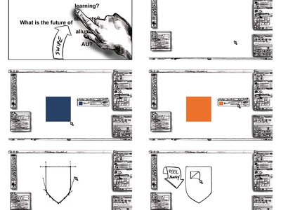
A hand scrolls over options for the future of Athabasca University before a logo is made in Photoshop, starting with the brand color. The Photoshop background with windows was sketched to give visual consistency to the storyboards.

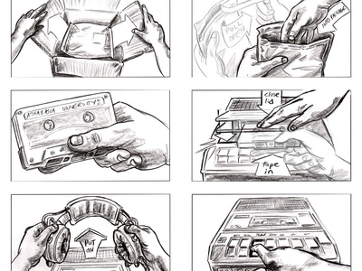
This promotional video began with hands (sketched realistically for live action) opening a box, then finding and playing an Athabasca University cassette tape. While this sequence wasn't used, it's easy to see how storyboards can quickly give directors multiple options.

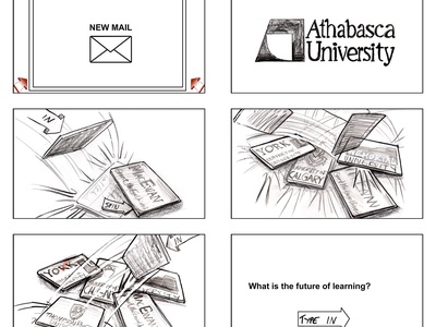
Continuing the animated storyboard sequence, Athabasca University's competitors are thrown onto the screen as graphics piling up on top of each other.
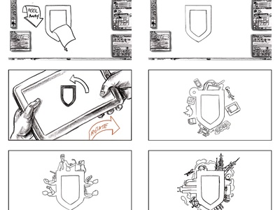
As the inside of Athabasca University logo is peeled away in Photoshop, we see the logo stay in place while the rest of the screen becomes a rotating tablet. Illustrations from the logo help the narrative mention online tools, media, and sessions.

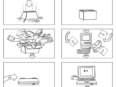
Cutting from live action to a simple animation, a box drops onto the screen and sends educational materials flying out until a laptop enters and opens. Switching visual styles interchangeably is a great challenge for storyboard artists.

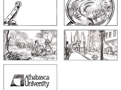
A finger brings a contact lens closer to the camera, showing a window into the different worlds and locations of online students. Conveying different locations is important for a storyboard artist.


 Kris Friesen
